
Plan housing with evidence, not assumptions
Scenario modelling, housing data, and financial planning in one platform — built for the teams being asked to act on housing and homelessness without the tools to do it.
Available to Canadian communities · May 2026
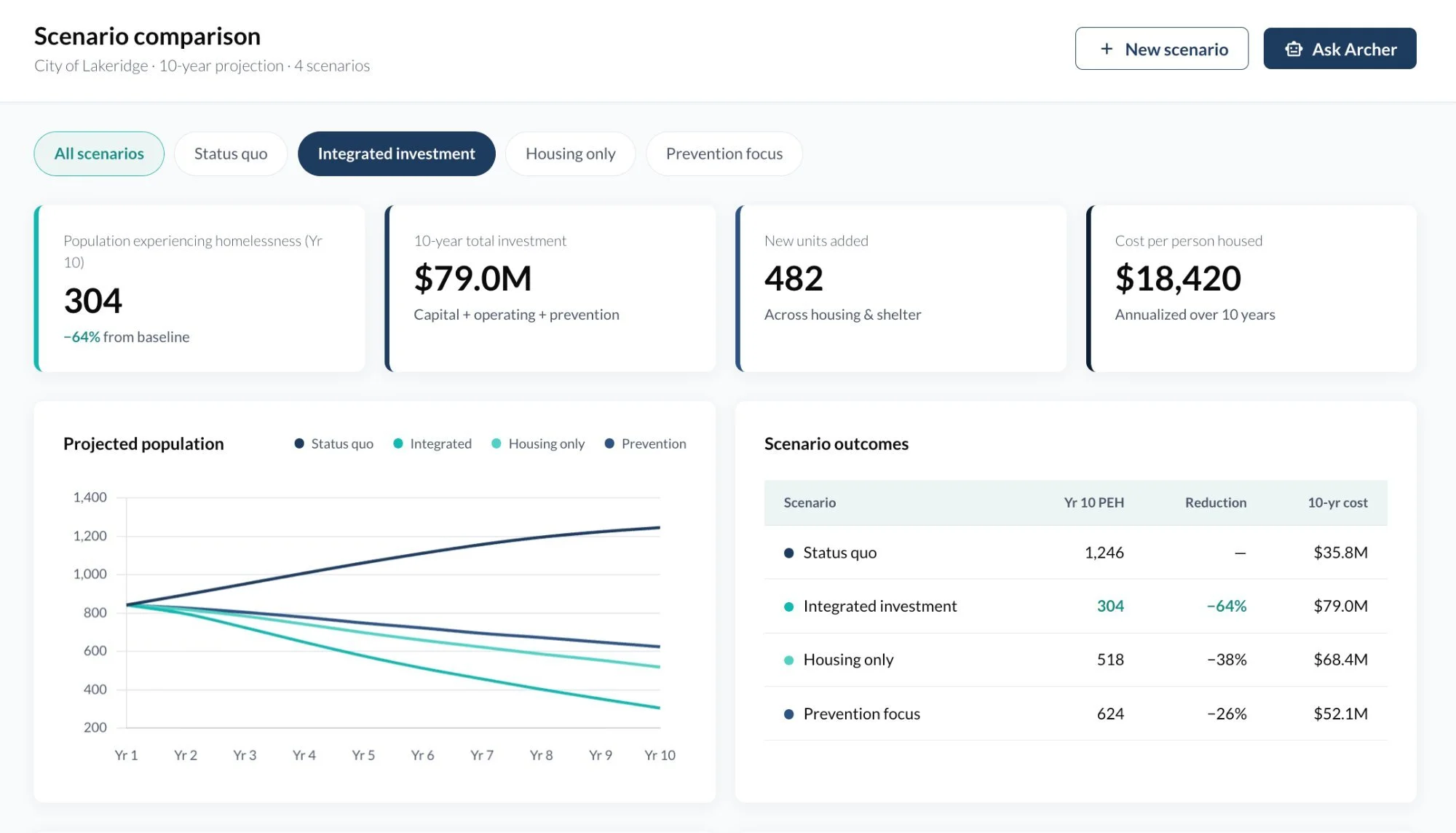
Homelessness modelling — compare scenarios side by side and see what each strategy does over ten years.
Four tools. One platform. Built for the decisions you are making right now.
INSIDE THE PLATFORM
Move from reactive reporting to proactive planning

WHAT KARTO DOES FOR YOUR TEAM
Model what happens before you commit the budget
Defend your housing strategy with real projections, not estimates
Respond to funding calls in days, not months
See the full financial picture across your housing pipeline
Compare your community against similar regions across Canada
Replace $50K–$100K consulting engagements with always-on tools
TOOL 1
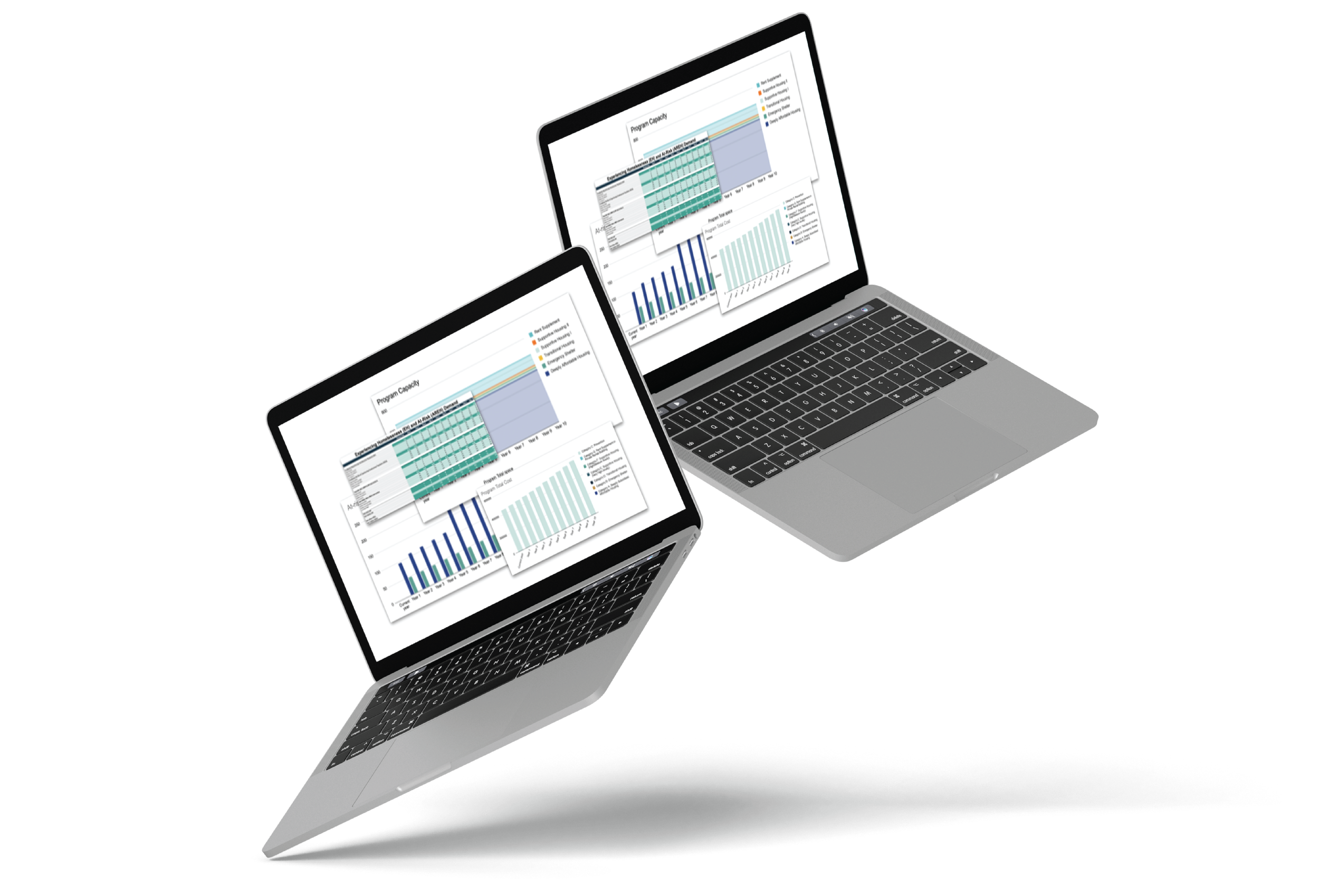
Homelessness Modelling
See what your system needs before you are in crisis.
Model your community's homelessness and deeply affordable housing continuum — from prevention through emergency shelter through to permanent housing. Enter your numbers, then change the variables: add beds, shift to prevention, change who you serve, adjust intake rates.
See what each decision does to population flows, system costs, and downstream pressure over five to ten years. Run as many scenarios as you need. Compare them side by side.
Built for service managers, system planners, and directors of housing and homelessness
AI-ENABLED
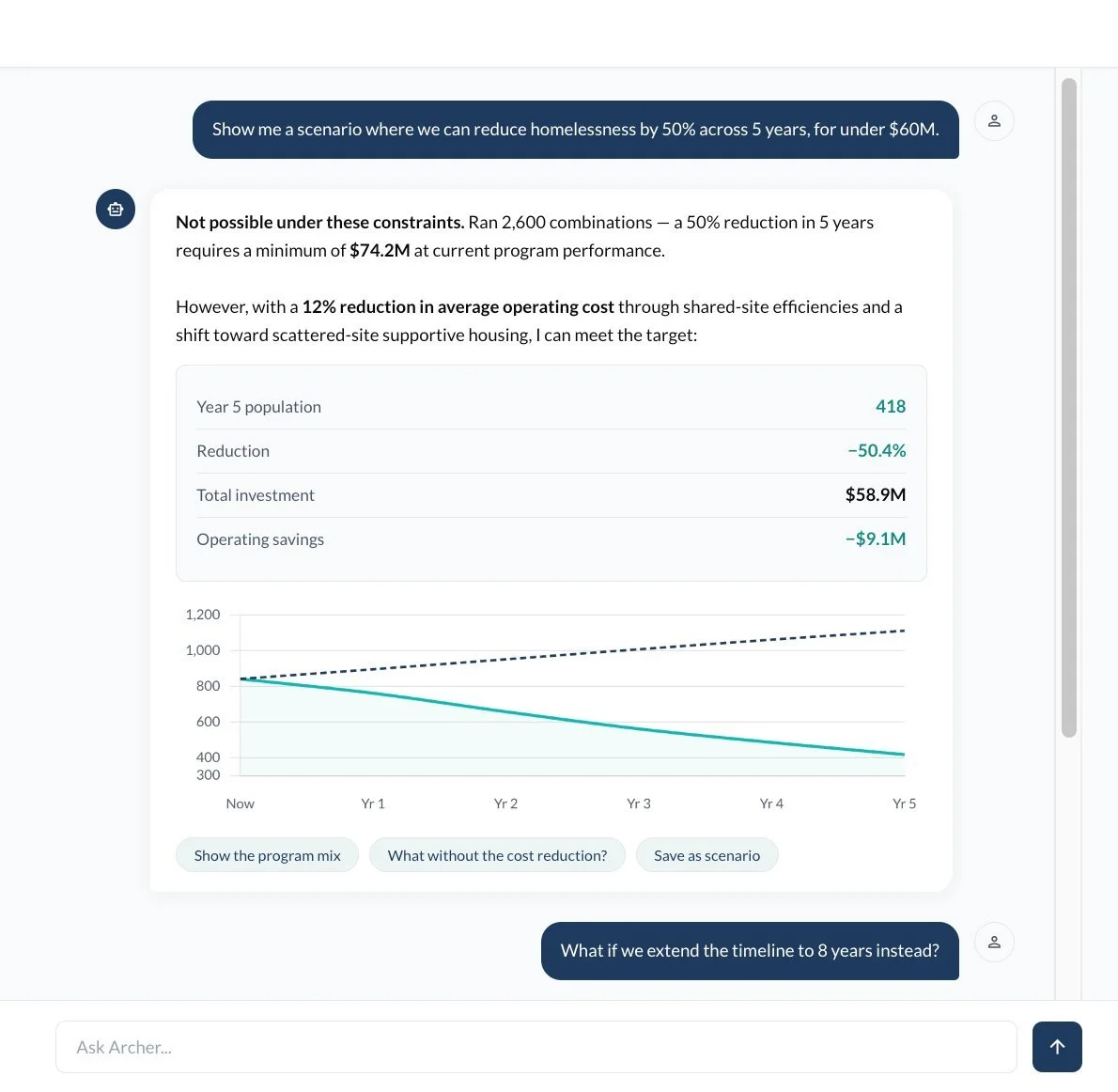
Ask Archer anything about your model
Archer is an AI layer built into the homelessness modelling tool. Ask it to explain results, test constraints, or build new scenarios from plain-language questions — and get answers grounded in your data, not generic outputs.
TOOL 2
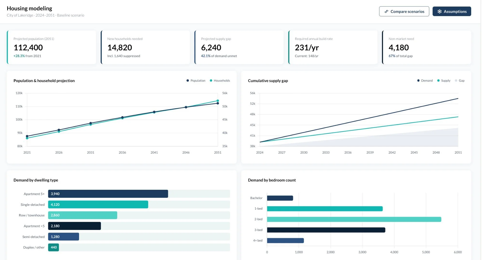
Housing Data and Modelling
All of your housing data, organized and ready for analysis.
Affordability, supply, demographics, and need — organized with consistent definitions across geographies and ready to use. See where pressures are building. Compare your community against regional, provincial, and national benchmarks.
Filter by geography and time period. Export any chart or table straight into strategy documents, funding applications, and Council reports. No more waiting for a consultant to pull the numbers together.
Homelessness modelling — compare scenarios side by side and see what each strategy does over ten years.
Built for housing teams, community planners, and policy staff
TOOL 3
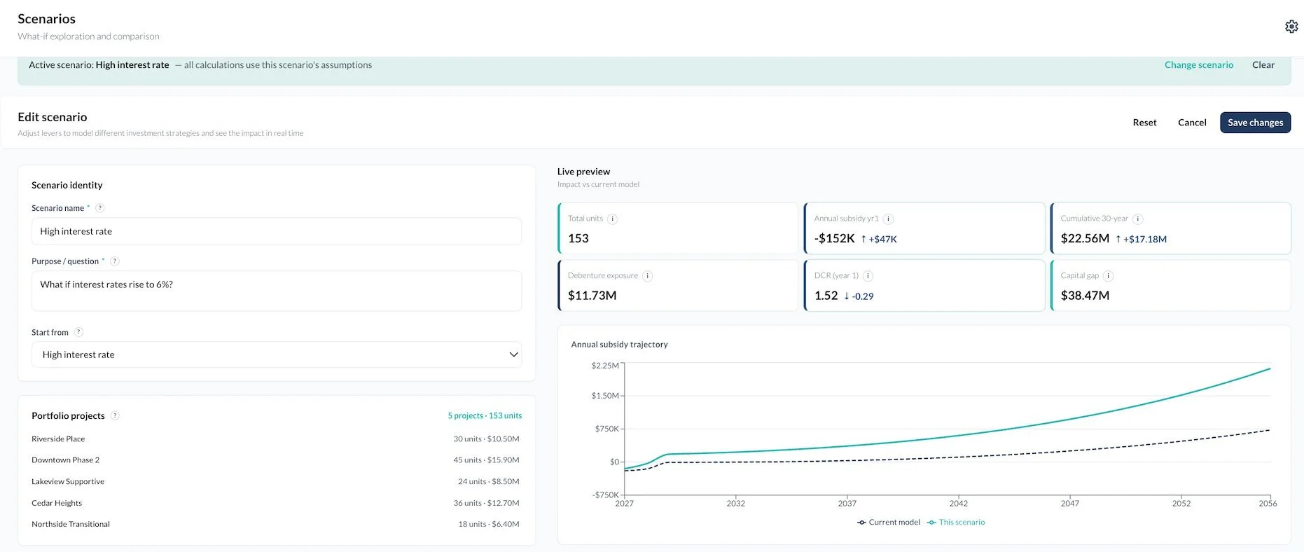
Financial Planning
Understand what your housing strategy actually costs.
Model the full financial picture across your affordable and supportive housing pipeline. What can you build, what financing works, and what operating obligations come with every building that opens. Test debenture ratios, grants, fee waivers, land contributions, subsidies, and property tax treatment.
Toggle projects in and out. Compare unlimited scenarios. Walk into a Council meeting knowing exactly what the numbers are.
Built for housing teams, community planners, and policy staff
Financial planning — model what-if scenarios and see the financial impact across your pipeline.
TOOL 4
Housing Trends
The broader picture behind the housing pressure.
Social and demographic trends alongside your housing data. Track what is driving demand — income shifts, migration, population growth, labour markets — and connect it to what is happening in your system.
Compare your community with similar regions across Canada. Every chart and table is exportable and ready for use in presentations, reports, and applications.
Built for housing and homelessness teams, policy and planning staff
The 2026 Census is coming, including new questions on hidden homelessness.
Karto will incorporate every census release within two weeks of publication — so your team can export updated analysis without commissioning a new Housing Needs Assessment.

Every subscription includes
-
Hands-on training across all four tools — uploading data, building scenarios, interpreting outputs, and exporting what you need.
-
A dedicated monthly meeting with a HelpSeeker systems planning expert. Your scenarios, your questions, real guidance.
-
Charts, tables, and branded reports ready for Council presentations, strategy documents, and funding applications.
-
New Census and public datasets flow in as they are released. No manual refresh. No re-commissioning reports.

We ground the model in reliable data (e.g., homeless counts, program metrics) and proven research. Every assumption – from inflow rates to program costs – is backed by data or clear reasoning, ensuring the scenarios are credible and relevant to your community.

We openly document all assumptions and invite your team’s input at every step. By collaborating with municipal staff, planners, and community organizations, we incorporate local knowledge and build shared understanding.
We design the modelling around the outcomes that matter most – like reduced homelessness, improved housing stability, and other key goals. Each scenario is evaluated by its impact on these outcomes, keeping attention on what truly counts for your community.
Our modelling emphasizes cost-effectiveness, showing the return on investment for various strategies. We link dollars to outcomes, so you can identify which interventions deliver the greatest impact per dollar spent.
We consider how different demographic or vulnerable groups are affected under each scenario, helping you plan interventions that are fair and inclusive. This ensures alignment with equity commitments by identifying who benefits and where gaps remain.
We don’t just look at the next budget cycle; we help you simulate long-term scenarios (5, 10, even 20 years out). By anticipating how needs and outcomes evolve, you can craft plans that stand the test of time.
Why Scenario Modelling Matters
When addressing housing needs and reducing homelessness, resources are limited, the environment is constantly changing, and decisions must be made with accountability and transparency. Scenario Modelling is important because it shifts the approach from reactive to proactive. Instead of hoping a plan works, you can see how and why it might work.
This scenario-based approach allows municipal staff, housing planners, policy teams, and nonprofit leaders to make informed choices grounded in evidence. You can test ideas like expanding shelter capacity or increasing rent subsidies and immediately understand the projected impact on homelessness numbers, costs, and community outcomes.